Australia’s most southern state has long been a magnet for tourists, drawn by its natural beauty and its history, and increasingly by cultural destinations such as MONA. But the capital city itself has traditionally been difficult for visitors to navigate due to the sloping topography and curvilinear streets. Most tourists, including those who arrive in Hobart on cruise ships, head straight for the waterfront and Salamanca Place and its cafés and art and design shops. Many never find their way into the central city, the route to which is obscured from the waterfront by a series of buildings, a busy road and a steep hill.
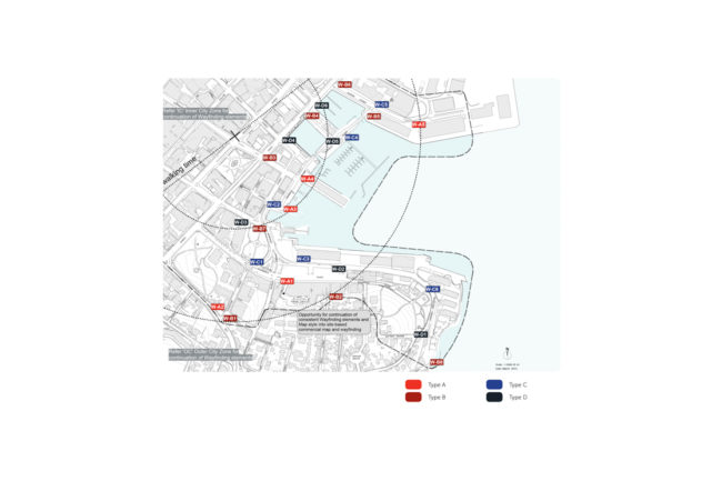
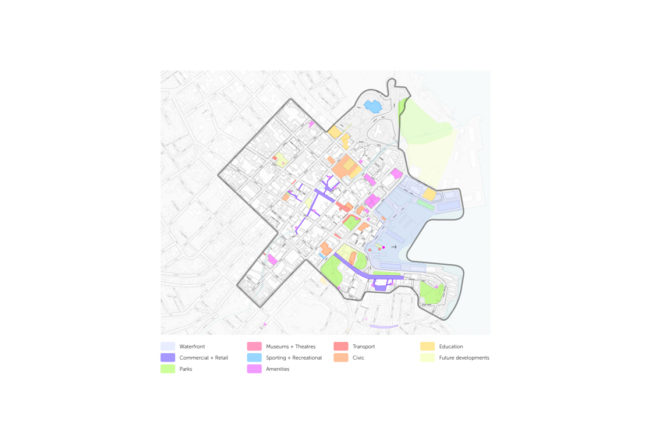
That was one of the problems lead consultant Arterial Design and Urban Initiatives were charged with solving when the design team took on the refurbishing of Hobart’s wayfinding system. In a sense, Hobart is the perfect pedestrian city, contained and very walkable. The challenge was to get people to see beyond the waterfront and realise there are many other sights to see and explore and to efficiently orient themselves to a convenient route across the prevailing transport direction.
Adopting the “breadcrumbs” approach to wayfinding, where visitors are given just enough information to entice them to the next interesting or useful location, Arterial and Urban Initiatives developed an approach to the signage that coaxes visitors towards the city centre, attraction by attraction, without bombarding people with a whole lot of information, but just enough to get them to the next useful location.
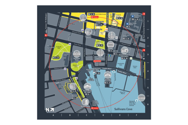
At key decision points visitors come across large-scale signs that provide three levels of information: pointers to key destinations or landmarks, including walking time; a ‘heads-up’ map of their immediate location showing directions to the destination oriented to where they are looking; and a larger map of the city and waterfront.
Developing a design style for the signage suite that would find a balance between the city’s heritage character and its desire to be seen as a ‘forward looking’ contemporary capital was another challenge. The iconic form of the sandstone blocks that make up many of the city’s heritage buildings inspired a tiling system for the signs that can be changed according to events, or in response to wear and tear or vandalism. The tiles, and the signs themselves, are crafted of stainless steel, designed to withstand the harsh coastal environment.
Location
Hobart, Tasmania
Role
Wayfinding Strategy & Design
Client
Hobart City Council
Construction Budget
$125K+
Collaboration
Traditional Owners
Nipaluna


